
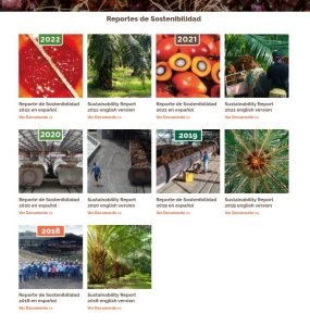
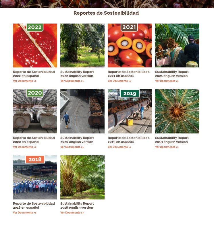
Este componente nos permite mostrar un conjunto de documentos con su respectiva imagen, nombre y link de descarga.
Campos Personalizados
Galería de Documentos
documents_gallery
(Block)
Cards de Documentos
field_document_cards
Reference revisions/Párrafo
Card de Documento
document_card
(Paragraph)
Documento
field_document
Referencia/Multimedia/Documento
Imagen
field_image
Referencia/Multimedia/Imagen
Título
field_title
Texto/Texto (sin formato)
Variación de color
field_color_variation
Texto/Lista (de texto)
Archivos Usados
1.
block--documents-gallery.html.twig
Twig
templates/blocks/
Block
1.
block--documents-gallery.html.twig
Twig
templates/blocks/
Block
{#
/**
* @file
* Theme override to display a block.
*
* Available variables:
* - plugin_id: The ID of the block implementation.
* - label: The configured label of the block if visible.
* - configuration: A list of the block's configuration values.
* - label: The configured label for the block.
* - label_display: The display settings for the label.
* - provider: The module or other provider that provided this block plugin.
* - Block plugin specific settings will also be stored here.
* - in_preview: Whether the plugin is being rendered in preview mode.
* - content: The content of this block.
* - attributes: array of HTML attributes populated by modules, intended to
* be added to the main container tag of this template.
* - id: A valid HTML ID and guaranteed unique.
* - title_attributes: Same as attributes, except applied to the main title
* tag that appears in the template.
* - title_prefix: Additional output populated by modules, intended to be
* displayed in front of the main title tag that appears in the template.
* - title_suffix: Additional output populated by modules, intended to be
* displayed after the main title tag that appears in the template.
*
* @see template_preprocess_block()
*/
#}
{% set class_block = 'documents-gallery' %}

{%
set classes = [
'block',
'block-' ~ configuration.provider|clean_class,
'block-' ~ plugin_id|clean_class,
'section-padding transition-scroll',
class_block,
]
%}

{% block content %}
{% set body = content.body[0] %}
{% set field_icon_cards = content.field_icon_cards %}
{% set color_variation = content.field_color_variation['#items'].value %}

{% if color_variation %}
  {% set class_variation = class_block ~ "--bg-" ~ color_variation %}
  {% if color_variation != 'white' and color_variation != 'alabaster' and color_variation != 'yellow' and color_variation != 'clean' %}
    {% set class_variation = class_variation ~ " co-white" %}
  {% endif %}
{% endif %}

<section{{ attributes.addClass(classes, class_variation) }}>
  <div class="container">
    {{ title_prefix }}
      {% if label %}
      <header class="{{class_block}}__title text-center mb-2">
        <h2{{ title_attributes }}>{{ label }}</h2>
      </header>
      {% endif %}
    {{ title_suffix }}

    <div class="{{class_block}}__items row">
      {% set card_items = content.field_document_cards['#items'] %}
      {% if card_items %}
        {% for key, item in card_items %}
          {% set card_item = item.entity %}
          {% set image_url = file_url(card_item.field_image.entity.field_media_image.entity.uri.value) %}
          {% set image_alt = card_item.field_image.entity.field_media_image.alt %}
          {% set card_title = card_item.field_title.value %}
          {% set document_url = file_url(card_item.field_document.entity.field_media_document.entity.uri.value) %}
          {% set document_text = 'Ver Documento >>' %}

          <div class="card mt-5 mb-0 {{class_block}}-card col-sm-6 col-md-4  col-lg-3">
            <article class="card__wrapper {{class_block}}-card__wrapper">
              {% if image_url %}
              <figure class="card__image {{class_block}}-card__image corner-m">
                <img src="{{image_url}}" alt="{{image_alt}}" class="w-100"/>
              </figure>
              {% endif %}
              {% if card_title %}
              <header class="card__title {{class_block}}-card__title">
                <h3>{{ card_title }}</h3>
              </header>
              {% endif %}
              {% if document_url %}
              <div class="{{class_block}}__cta" >
                <a href="{{document_url}}" class="button-text" target="_blank" rel="noopener noreferrer">
                  {{ document_text }}
                </a>
              </div>
            {% endif %}
            </article>
          </div>
        {% endfor %}
      {% endif %}
    </div>
  </div>
</section>
{% endblock %}
2.
_documents-gallery-card.scss
SCSS
frontend/scss/theme/cards/
Styles
2.
_documents-gallery-card.scss
SCSS
frontend/scss/theme/cards/
Styles
.documents-gallery-card {
  &__image {
    @include fluid-aspect(1 1, 'img');
  }
}
3.
_documents-gallery.scss
SCSS
frontend/scss/theme/components/
Styles
3.
_documents-gallery.scss
SCSS
frontend/scss/theme/components/
Styles
.documents-gallery {
  padding: space(1.5) 0 space(1) 0;

  &-card__title {
    h3{
      font-size: rem(25px) !important;
      text-wrap: wrap;
    }
  }

  &__cta {
    &, * {
      color: $green;
      font-size: rem(17px);
      font-weight: 600;
    }
  }
}
