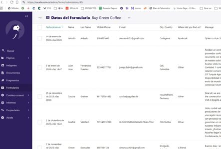
Cómo descargar Formularios/Leads en Wagtail (Racafe)
Este artículo documenta el proceso para...


Este componente crea un grid de iconos con su respectivo título y texto, también tiene la posibilidad de centrar los elementos o alinearlos a la izquierda.
Para el campo de Número de card por Fila usamos los siguientes valores:
col-12|Uno
col-12 col-lg-6|Dos
col-12 col-md-6 col-lg-4|Tres
col-12 col-sd-6 col-md-4 col-lg-3|Cuatro
Mosaico de Íconos
icons_grid
(Block)
Body
body
Texto/Texto (con formato, largo, con resumen)
Icon Cards
field_icon_cards
Reference revisions/Párrafo
Card de Ícono
icon_card
(Paragraph)
Cuerpo de texto
field_body
Texto/Texto (con formato)
Imagen
field_image
Referencia/Multimedia/Imagen
Título
field_title
Texto/Texto (sin formato)
Número de card por Fila
field_number_cards_row
Texto/Lista (de texto)
Texto alineado Izquierda
field_is_left_aligned
General/Booleano
Variación de color
field_color_variation
Texto/Lista (de texto)
block--icons-grid.html.twig
Twig
templates/blocks/
Block
{#
/**
* @file
* Theme override to display a block.
*
* Available variables:
* - plugin_id: The ID of the block implementation.
* - label: The configured label of the block if visible.
* - configuration: A list of the block's configuration values.
* - label: The configured label for the block.
* - label_display: The display settings for the label.
* - provider: The module or other provider that provided this block plugin.
* - Block plugin specific settings will also be stored here.
* - in_preview: Whether the plugin is being rendered in preview mode.
* - content: The content of this block.
* - attributes: array of HTML attributes populated by modules, intended to
* be added to the main container tag of this template.
* - id: A valid HTML ID and guaranteed unique.
* - title_attributes: Same as attributes, except applied to the main title
* tag that appears in the template.
* - title_prefix: Additional output populated by modules, intended to be
* displayed in front of the main title tag that appears in the template.
* - title_suffix: Additional output populated by modules, intended to be
* displayed after the main title tag that appears in the template.
*
* @see template_preprocess_block()
*/
#}
{% set class_block = 'mosaic-icons' %}

{%
set classes = [
'block',
'block-' ~ configuration.provider|clean_class,
'block-' ~ plugin_id|clean_class,
'section-padding',
class_block,
]
%}

{% block content %}
{% set body = content.body[0] %}
{% set field_icon_cards = content.field_icon_cards %}
{% set color_variation = content.field_color_variation['#items'].value %}
{% set cards_row = content.field_number_cards_row['#items'].value %}
{% set is_left = '1' in content.field_is_left_aligned['#items'].value %}

{% if color_variation %}
  {% set class_variation = class_block ~ "--bg-" ~ color_variation %}
  {% if color_variation != 'white' and color_variation != 'alabaster' and color_variation != 'yellow' and color_variation != 'clean' %}
    {% set class_variation = class_variation ~ " co-white" %}
  {% endif %}
{% endif %}

<section{{ attributes.addClass(classes, class_variation) }}>
  <div class="container">
    {{ title_prefix }}
      {% if label %}
      <header class="{{class_block}}__title text-center transition-scroll mb-5">
        <h2{{ title_attributes }}>{{ label }}</h2>
        {% if body %}
          {{body}}
        {% endif %}
      </header>
      {% endif %}
    {{ title_suffix }}

    <div class="{{class_block}}__items row g-5 {{is_left ? 'justify-content-start' : 'justify-content-center'}}">
      {% set card_items = content.field_icon_cards['#items'] %}
      {% if card_items %}
        {% for key, item in card_items %}
          {% set card_item = item.entity %}
          {% set image_url = file_url(card_item.field_image.entity.field_media_image.entity.uri.value) %}
          {% set image_alt = card_item.field_image.entity.field_media_image.alt %}
          {% set card_title = card_item.field_title.value %}
          {% set card_body = card_item.field_body.value %}

          <div class="card transition-scroll mb-5 {{class_block}}-card {{cards_row}} {{is_left ? class_block ~ '-card--left-aligned' : ''}}">
            <article class="card__wrapper {{class_block}}-card__wrapper">
              {% if image_url %}
              <figure class="card__image {{class_block}}-card__image">
                <img src="{{image_url}}" alt="{{image_alt}}" class="w-100"/>
              </figure>
              {% endif %}
              {% if card_title %}
              <header class="card__title {{class_block}}-card__title mb-3">
                <h3>{{ card_title }}</h3>
              </header>
              {% endif %}
              {% if card_body %}
                <div class="card__body {{class_block}}-card__body">
                    {{card_body  | raw }}
                </div>
              {% endif %}
            </article>
          </div>
        {% endfor %}
      {% endif %}
    </div>
  </div>
</section>
{% endblock %}
_mosaic-icons.scss
SCSS
frontend/scss/theme/components/
Styles
.mosaic-icons {
  padding-bottom: space(2) ;
  &__title {
    @include from(l){
      align-items: center;
      display: flex;
      flex-direction: column;
      & > * {
        max-width: rem(1000px);
      }
    }
  }
}
_mosaic-icons-card.scss
SCSS
frontend/scss/theme/cards/
Styles
.mosaic-icons-card {
  $self: &;

  &__image {
    text-align: center;
    img{
      max-width: rem(200px);
    }
  }

  &__title {
    text-align: center;
  }

  &__body {
    &, & > *:not(.root) {
      text-align: center;
    }
    ul{
      list-style: disc;
    }
  }

  &--left-aligned {
    * {
      text-align: left !important;
    }
  }
}

Este artículo documenta el proceso para...
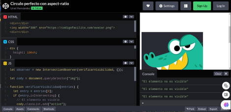
Aquí vamos a ver cómo detectar cuando un...